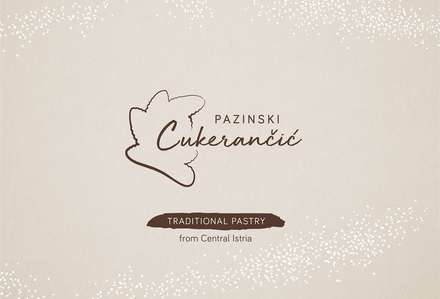
Package design of "Pazinski cukerančić"
This project aims to tell a story of preserving traditional gastronomy in Istria. The packaging design of Pazinski cukerančić, an indigenous Istrian delicacy whose art of making is protected as Croatian intangible cultural heritage, reveals the tale detail by detail, making the experience of tasting the famed pastry intriguing and instructive.
About Pazinski cukerančić
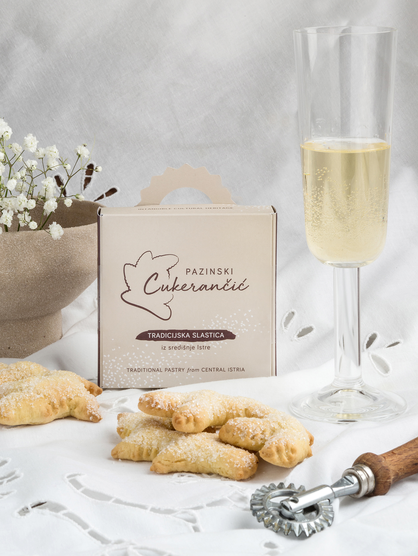
Recognizable by its distinctive form, taste, and golden-like color, Pazinski cukerančić is one of the most significant traditional Istrian desserts. Not so long ago, it was a wedding pastry whose making was an occasion for female gatherings in Istrian households. Nowadays, it is an unavoidable dessert at family celebrations.
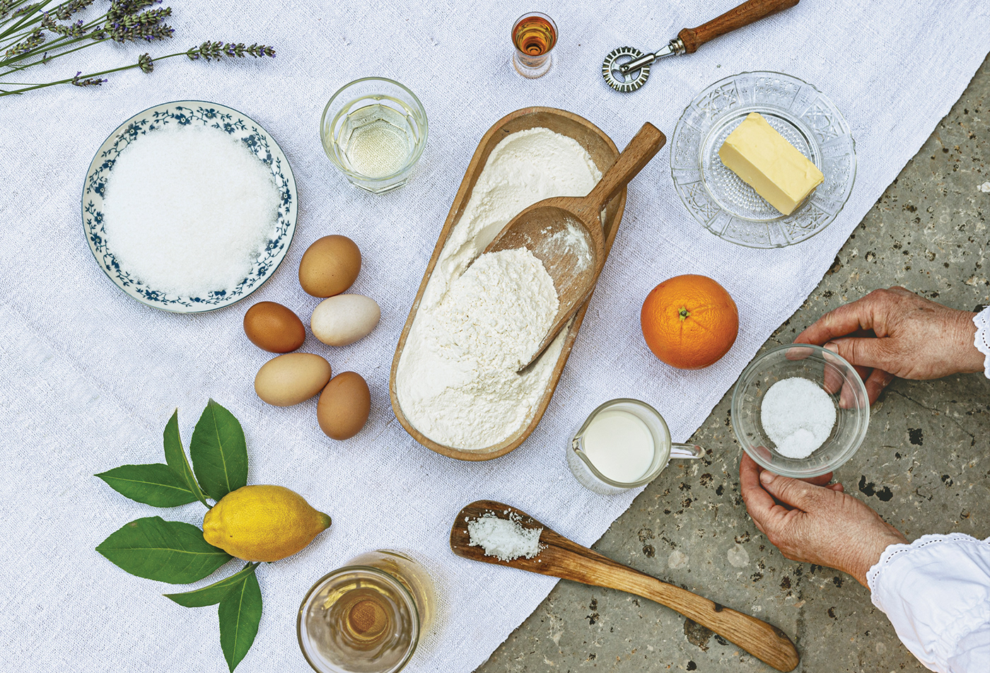
Because it differs from other recipes across Istria, the art of making cukerančić in the area of Pazin has been protected as Croatian intangible cultural heritage since 2018. To make a Pazinski cukerančić, you have to use ammonia instead of baking powder, and before sprinkling the pastry with sugar, dip it into white wine to intensify its juiciness. The final appearance of this golden-like pastry has a distinctive branched form.
Objective and project phases
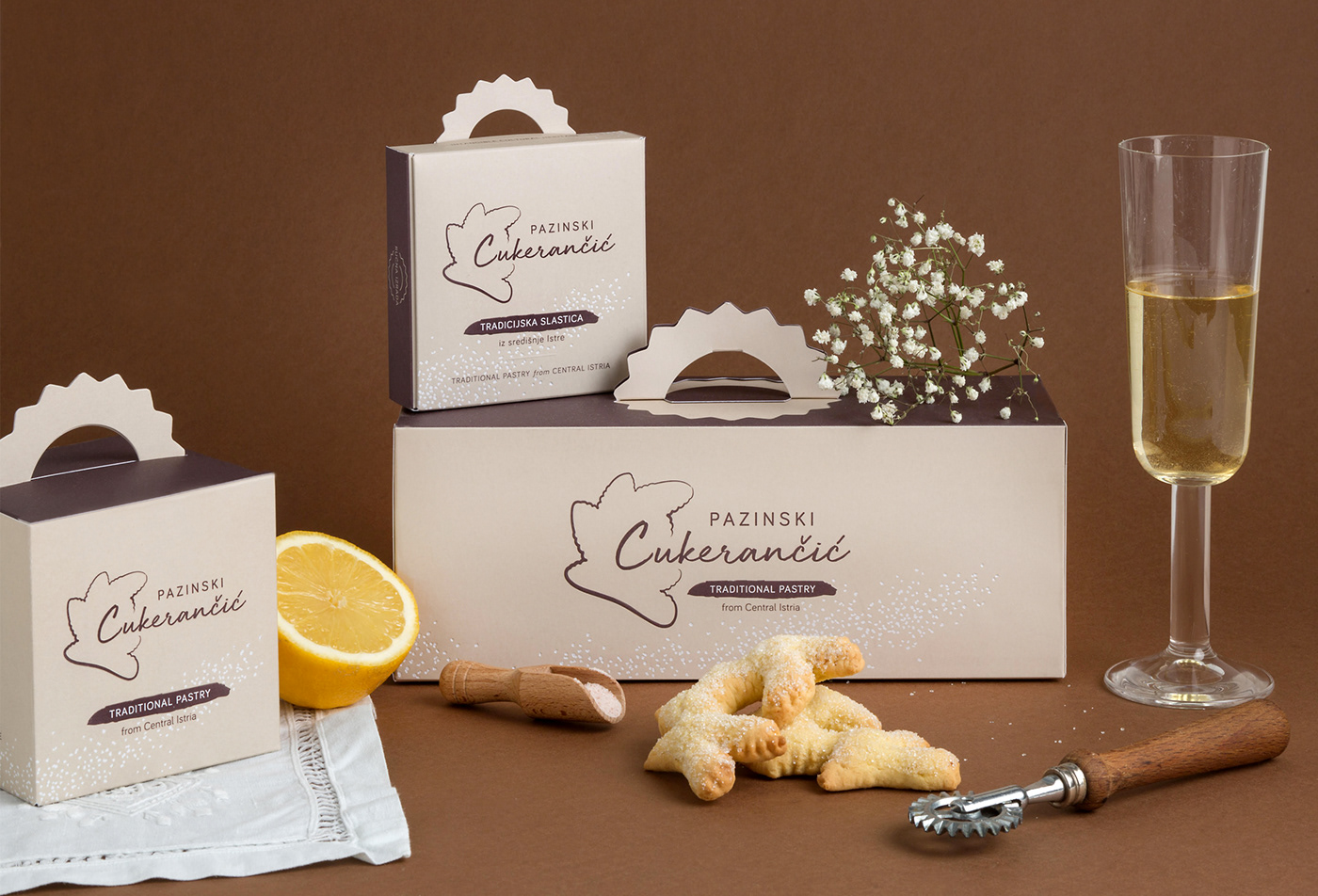
The objective was to create an intriguing visual identity and design for three package types of different dimensions.
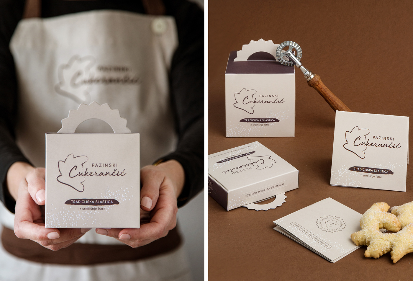
During the first phase, we have designed the logo and set the visual identity guidelines. We have also designed a leaflet explaining the socio-cultural context of the pastry, including its original recipe.
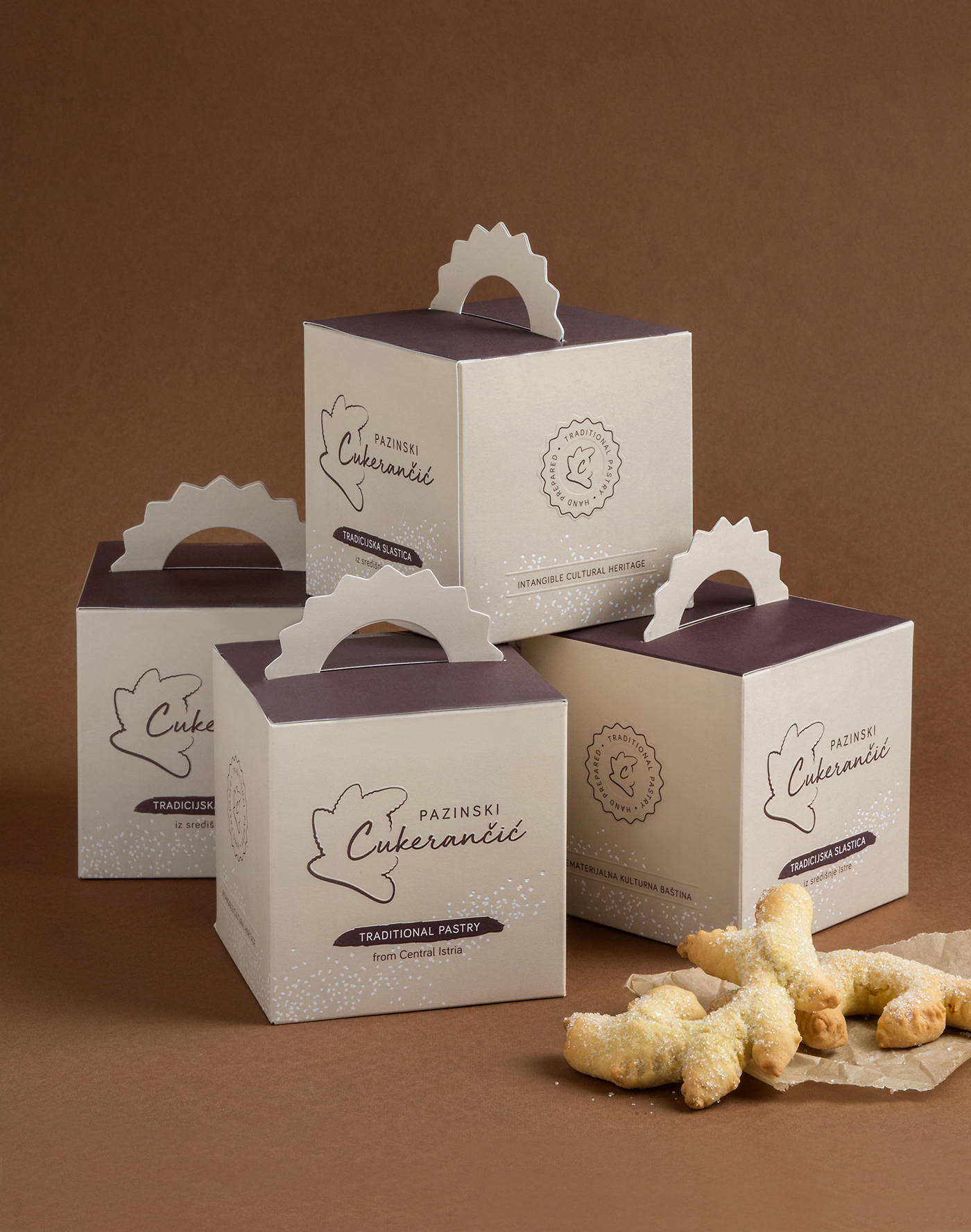
For the packaging to be practical in all phases of its lifecycle (storage, filling, delivery), we have designed box sizes for 1, 5, and 15 pieces of pastry, respecting all agreed technical requirements.
Package design concept
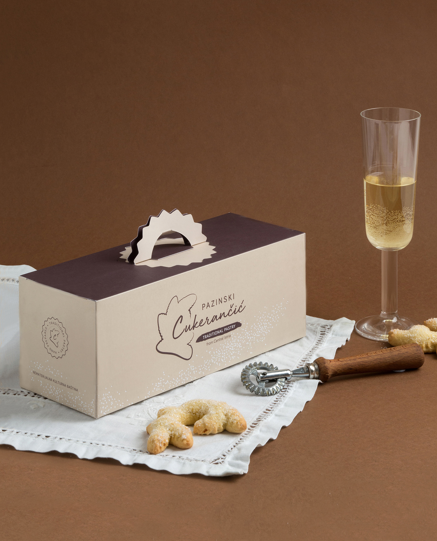
We based the visual identity on pastel tones with contrasting white and brown details. The white color symbolizes a wedding ceremony, while brown indicates tradition and the colors of Istrian folk costumes.
The minimalist design reflects the simplicity of the pastry itself and the modest way of life in Istria. Each element of the packaging adds to the whole story of Pazinski cukerančić, leaving the consumer to discover it detail by detail:
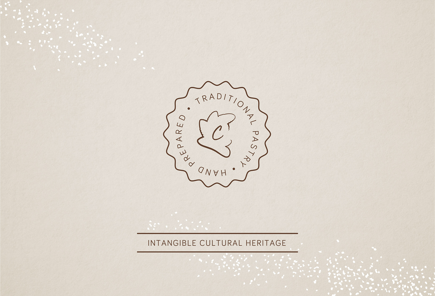
Stamp - The packaging sides contain stamps with inscriptions emphasizing a handmade dessert and an intangible cultural heritage. The stamp has the shape of rulić, a tool for shaping the pastry in its recognizable branched form.
Handle - The handle that is 'notched' into the package imitates the act of notching the pastry to get its characteristic branched form, thus further emphasizing the use of rulić tool in its making.
Sugar - Using hot foil printing, we enhanced the package design with a decorative pattern of white dots that indicates sprinkling the pastry with white sugar and reminds of the wedding ceremony of tossing rice.
Box - The general aim is to educate the consumer about the socio-cultural importance of the pastry before tasting it. Therefore, the box contains the pastry wrapped in white decorative paper, with a leaflet on top. That way, the consumer follows a carefully structured narrative intended to give an authentic experience before tasting

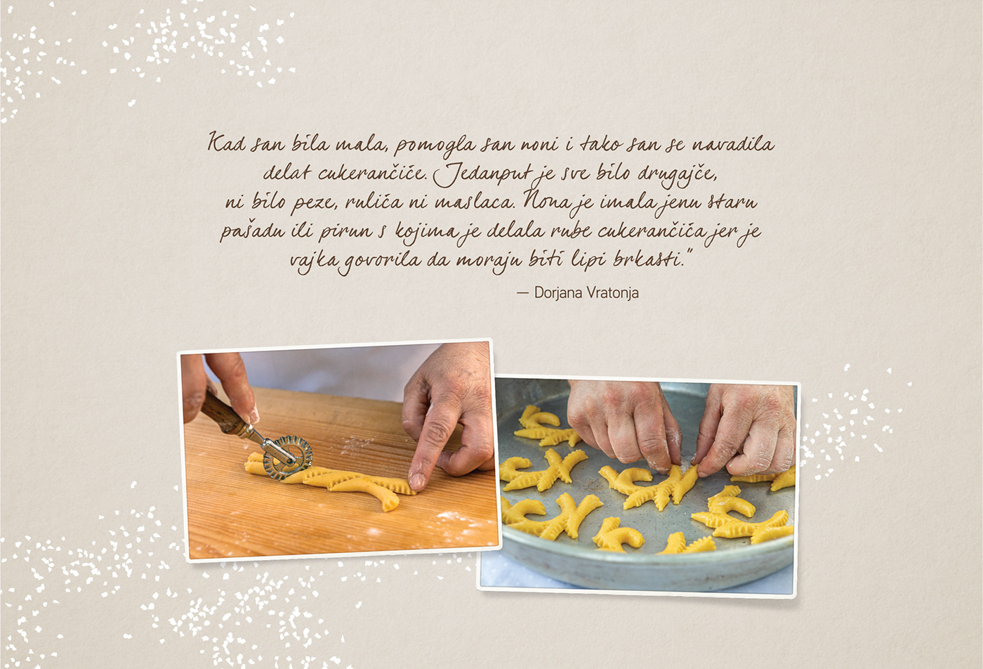
„When I was little, I used to help my Granny, and that’s how I learned how to make cukerančići. Everything was different then, there were no scales, no baking wheels or butter. Granny had an old knife or a fork to work the edges of cukerančići to make them nice and curly.”
— Dorjana Vratonja
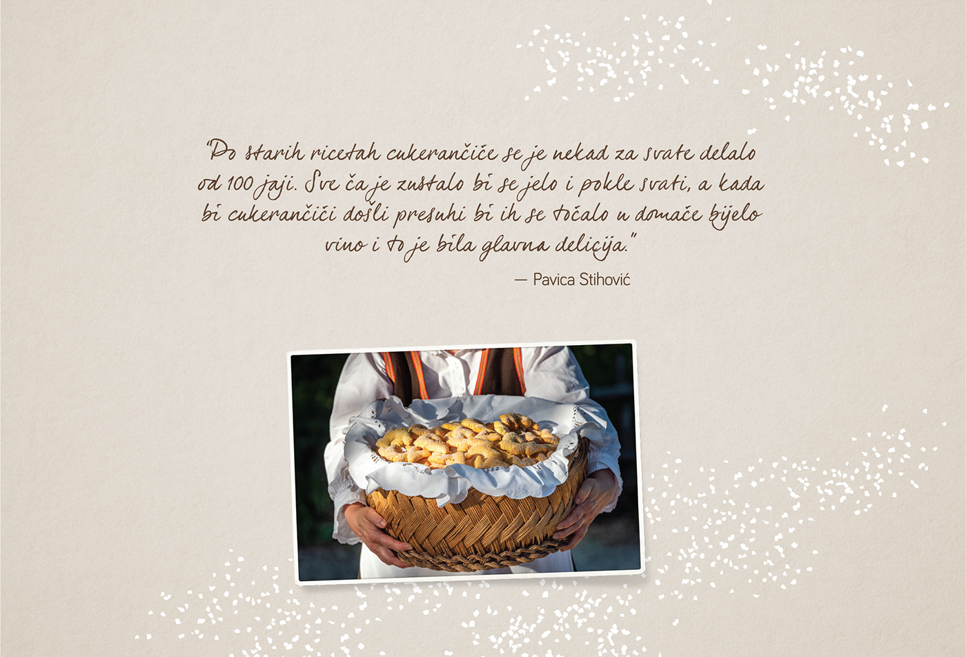
„According to old recipes, cukerančići for weddings were made from 100 eggs. If any left, they would be eaten
after the wedding and when they began to dry, they would be dipped in homemade white wine.
This was considered to be a great delicacy among local citizens.“
— Pavica Stihović
— Pavica Stihović
::CROATIAN::
Projekt oblikovanja ambalaže za Pazinski cukerančić, slastice čije je umijeće izrade zaštićeno nematerijalno kulturno dobro, ima cilj da korisniku na intrigantan način, kroz sve elemente i detalje dizajna, djelić po djelić razotkrije autentičnu priču o očuvanju tradicijske gastronomije u Istri.
Pazinski cukerančić
Pazinski cukerančić, tradicionalna istarska slastica, prepoznatljiv je po svom izgledu zlatno-žute boje, osebujnoj teksturi i okusu. Nekada je bio glavni svatovski kolač i povod za okupljanje i druženje žena u domaćinstvima diljem središte Istre, a danas je nezaobilazna slastica na važnim obiteljskim proslavama.
U Istri se izrada i receptura cukerančića razlikuje od mjesta do mjesta, no umijeće izrade Pazinskog cukerančića je, zbog svojih specifičnosti, 2018. godine uvršteno na popis nematerijalne kulturne baštine Republike Hrvatske.
Pazinski cukerančić odlikuje karakterističan razgranati izgled, u njegovoj se recepturi umjesto praška za pecivo koristi amonijak. Prije posipanja bijelim šećerom, Pazinski se cukerančić umače u vino te tako dobiva na sočnosti.
Cilj i faze projekta
Cilj projekta bio je osmisliti vizualni identitet i dizajnirati ambalažu za tri vrste pakovanja različite gramature.
U prvoj fazi je osmišljen logotip projekta, postavljene su smjernice za vizualni identitet a zatim dizajniran letak s receptom za izradu Pazinskog cukerančića te informativnim sadržajem o kulturnoj i tradicijskoj važnosti kolača i njegova umijeća izrade.
Poštujući dogovorene tehničke zahtjeve da ambalaža bude funkcionalna i kvalitetna u svim fazama korištenja (skladištenje, punjenje, transport), osmišljene su veličine kutija za 1, 5 i 15 komada kolača.
Koncept dizajna ambalaže
Kako bi se istaknuo značaj Pazinskog cukerančića kao svatovske slastice, vizualni identitet je temeljen na pastelnim tonovima s kontrastima bijele boje kao simbola vjenčanog obreda te smeđe koja upućuje na boje istarske narodne nošnje naglašavajući tako tradicijski element. Minimalistički dizajn odraz je jednostavnosti slastice, nepretencioznog načina života i ljudi u Istri, a svaki element ambalaže otkriva privlačnu priču o cukerančiću:
Pečat - Bočne strane ambalaže ukrašene su pečatom čiji je oblik izveden iz rulića, alata koji se koristi za oblikovanje i dobivanje razgranate strukture cukerančića, a sadrži natpis koji naglašava da se radi o ručno rađenoj slastici te nematerijalnom kulturnom dobru.
Ručka - Element rulića implementiran je i u dizajn ručke, koja se 'zarezuje' u kutiju, oponašajući radnju zarezivanja cukerančića te tako dodatno naglašavajući autentičnost izrade kolača.
Šećer - Dekorativni uzorak bijelih točkica na ambalaži izveden tehnikom foliotiska aludira na bijeli kristalni šećer kojim se posipava cukerančić, ali podsjeća i vjenčani običaj bacanja riže.
Kutija - S namjerom da se korisnika prije same degustacije informira o sociokulturnoj važnosti slastice te na intrigantan način provede kroz zamišljeni narativ, u kutiju je postavljen informativni letak, a ispod njega cukerančić omotan u bijeli dekorativni papir.
Client: LAG Središnja Istra, Pazin (Croatia)
Project category: Visual identity, Packaging
Year: 2020.
Project category: Visual identity, Packaging
Year: 2020.
AWARDS AND HONORS:
AWARDS AND HONO
Zagreb Design Week 2021, Finalist
